

- ingersoll rand -
website redesign
Ingersoll Rand is a multinational company that provides flow creation and industrial products. The company was formed in February 2020 through the spinoff of the industrial segment of Ingersoll-Rand (now known as Trane Technologies) and its merger with Gardner Denver.
Its products are sold under more than 40 brands across all major global markets. Ingersoll Rand operates in two segments: Industrial Technologies and Services and Precision and Science Technologies.
how i contributed
my role
Lead Designer
UX/UI Design
Stakeholder Interviews
Vision Alignment Session
Content Audit
Experience Audit
Website Recommendations
Information Architecture
Navigation Recommendations
Wireframes
User Validation (wireframes)
Digital Design Exploration & Interaction Patterns
Template Designs
Digital Style Guide
Interactive Prototypes
Weekly Stakeholder Presentations
collaboration
Engineering
Product Management
Client Marketing Teams
Global Demand Generation
year
2022-2023
overview
Refresh the design of the global mobile and web experience to drive digital engagement for the Power Tools and Lifting Solutions business
the problem
The Power Tools and Lifting Solutions department was looking to bring their brand into 2023 with a greater global presence - there was a strong sentiment amongst the team that the site was out-dated, difficult to navigate and did not provide a “wow factor."
Having worked with previous agencies towards a solution, the Ingersoll Rand team members were left disappointed and feeling unheard.
objectives
Create website templates that meet customer needs
Design a website to go beyond regional use to global relevance
Build alignment around a single design direction across departments
the process
DiscoveryContent Audit
Web Recommendations
Competitive / Comparative Analysis
Technical Audit
Stakeholder SME / Workshops
Customer Journeys
Vision Alignment
site foundation & design explorationInformation Architecture
Wireframes
Content Strategy
User Validation Research
Visual Design Direction
Product design & documentationTemplate Designs
Digital Style Guide
Component Library
Interactive Prototype
outcomes
Increased efficiency in the design process for future page design through 100+ reusable components designed with the atomic design methodology with built-in flexibility
Better brand perception through increased brand consistency and tools that enable more pervasive application of a design strategy across the page
Validated and tested components that will accelerate content development around content types that add value to the end customer experience and aim to increase site exploration and adoption
Defined and validated content concepts for future state uses of the website around aftermarket
content audit
mobile & webDid a full analysis of the site and organization structure which was used to identify design and usability pain points. IR was looking to create more consistent and robust content related to their top products and then further expand across rest of product lines.
pages audited
Navigation
Landing Pages
Category Pages
Product List Pages
500+ Product Detail Pages
Distributor Finder
Forms
Search
Informational Pages
Support / Services Pages

Screenshots
Captured screenshots of the pages in their current state across mobile & web devices - took notes of any unexpected interactions, errors and impressions
detailed documentation
Created an in-depth spreadsheet that included number of photos, videos, and other information for over 500 products
Translated findings into data visuals for IR’s internal team
website recommendations
Recommendations were driven by functionality, usability and best practices
focus areas
Live state of the overall IR website
Power Tools & Lifting Solutions
Corresponding pages across mobile & desktop

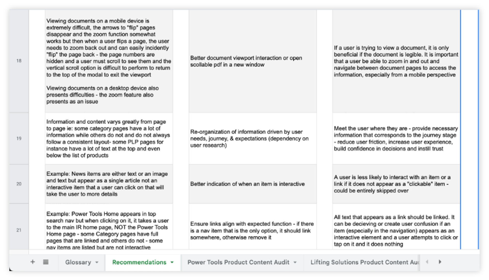
artifact
Created a thorough spreadsheet that outlined the current user experience and interface, along with proposed suggestions and the reasoning behind them
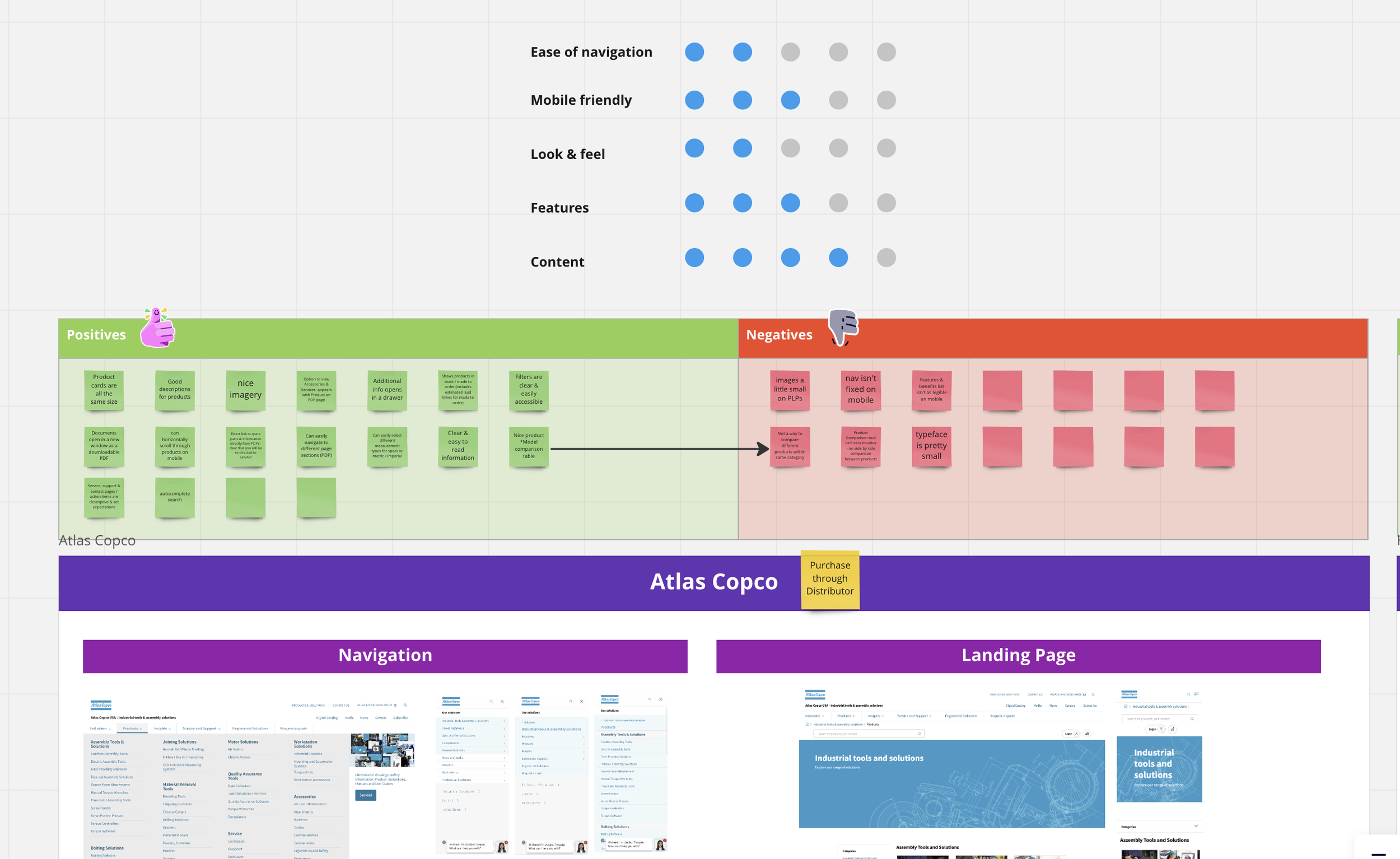
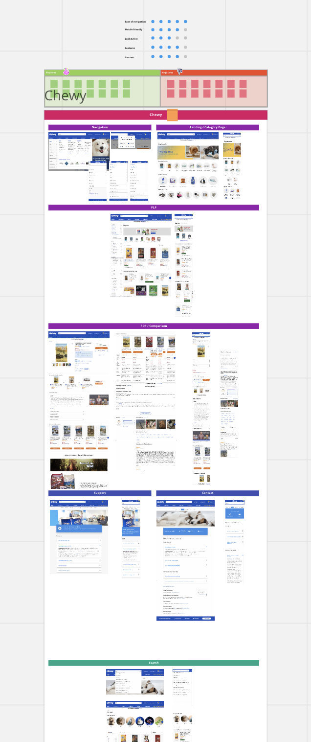
competitive / Comparative analysis
mobile & desktop
By considering both direct competitors and comparative experiences, we were able to establish a clearer picture of what principles might be leveraged to achieve a compelling experience that would meet and exceed customer expectations
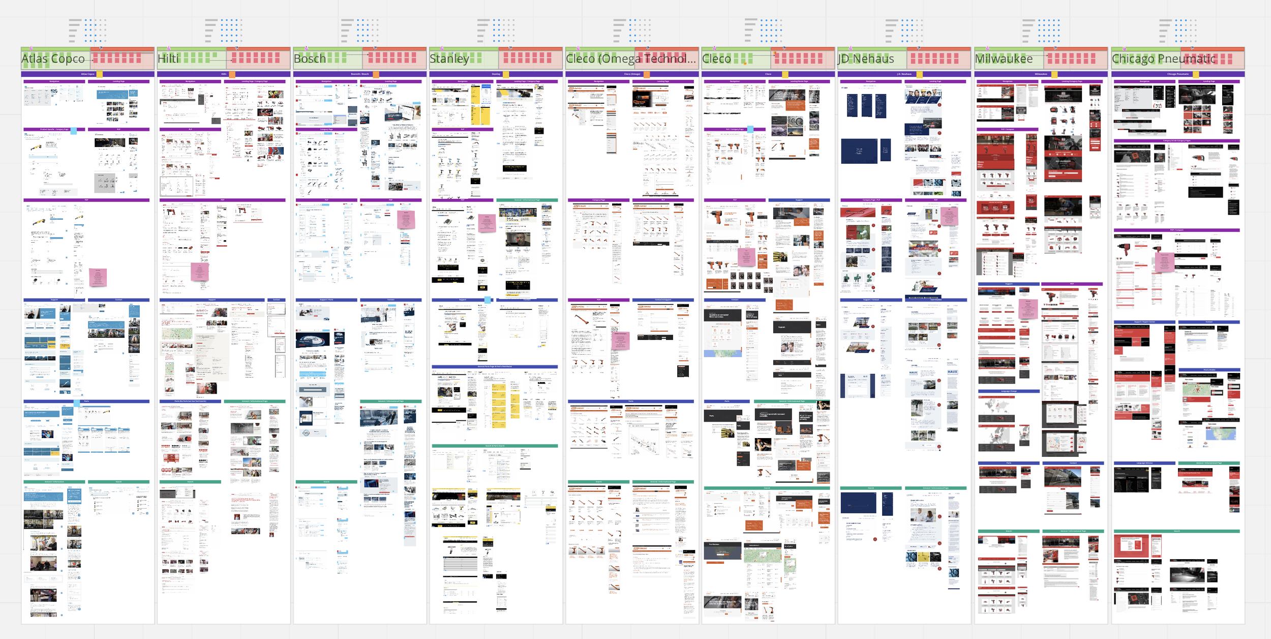
Created a detailed competitive analysis of 9 competitors (evaluated both web & mobile experiences) and 9 comparative examples to help drive IR into a forward thinking approach
stakeholder & subject matter expert (sme) interviews
Stakeholder and SME expertise was leveraged to define opportunities and pain points across the individual vertical user journeys. SMEs filled gaps of knowledge in the customer experience and helped to identify similarities and differences across vertical content needs
Talked with 4 Stakeholders and 6 SMEs
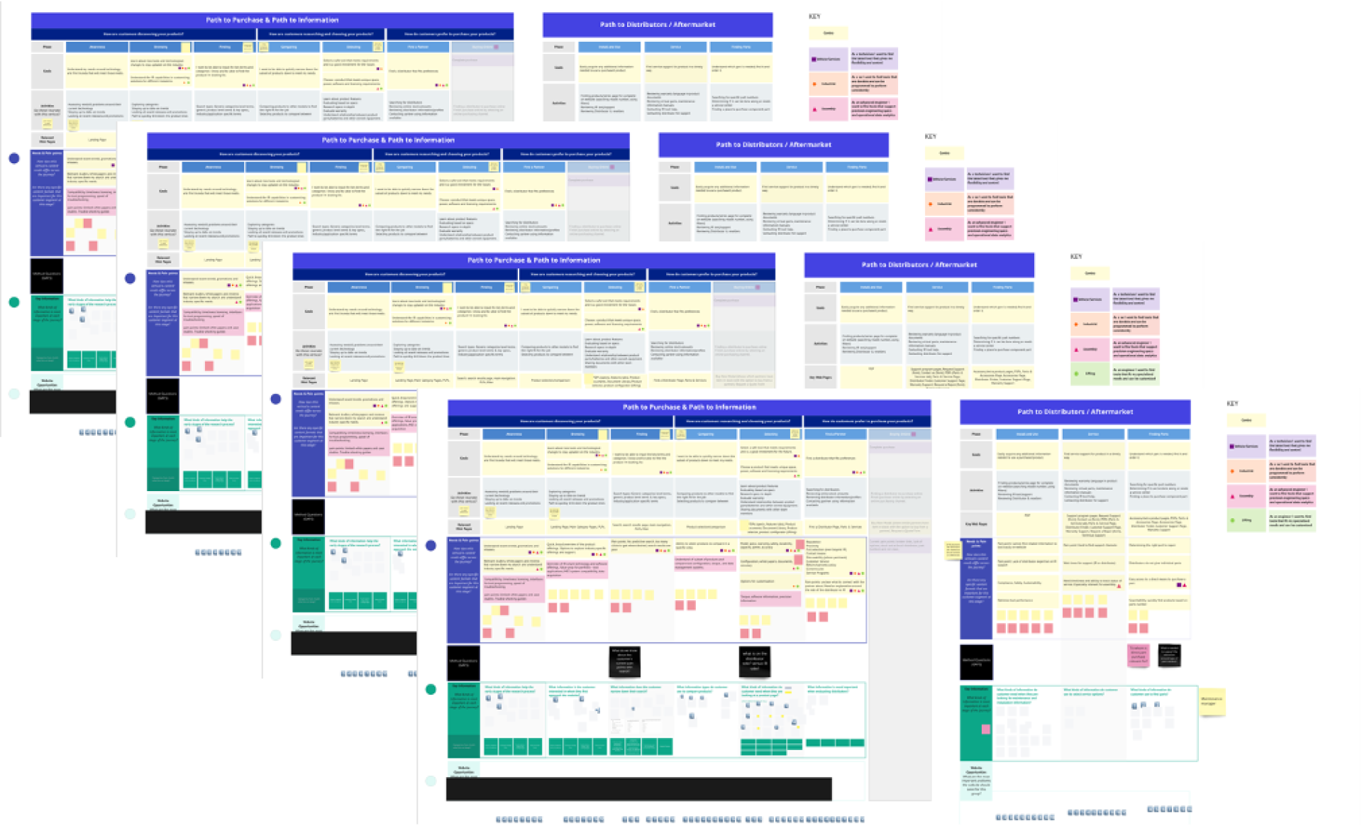
customer journey
Focus on actual user behavior vs. business intention. We really wanted to understand where the customer was experiencing the most pain when seeking to accomplish a specific goal and to prioritize features based on customer needs.

This was challenging because there were 4 different types of users with very specific needs and processes which all varied based on the type of product each user was seeking.
We could see the previous agencies' research but not their final work. By performing these interviews, we aimed to fill the information gaps. From previous research, we found that 51% of the site’s traffic came from mobile users, but IR hadn't tailored their experience to mobile users.
Vision alignment workshop
Together with the core team, conducted collaborative sessions to prioritize two core use cases (Path to purchase/information to purchase & Aftermarket) for design and testing. Worked together to define top content needs across each customer stage according to each use case

Two user flows
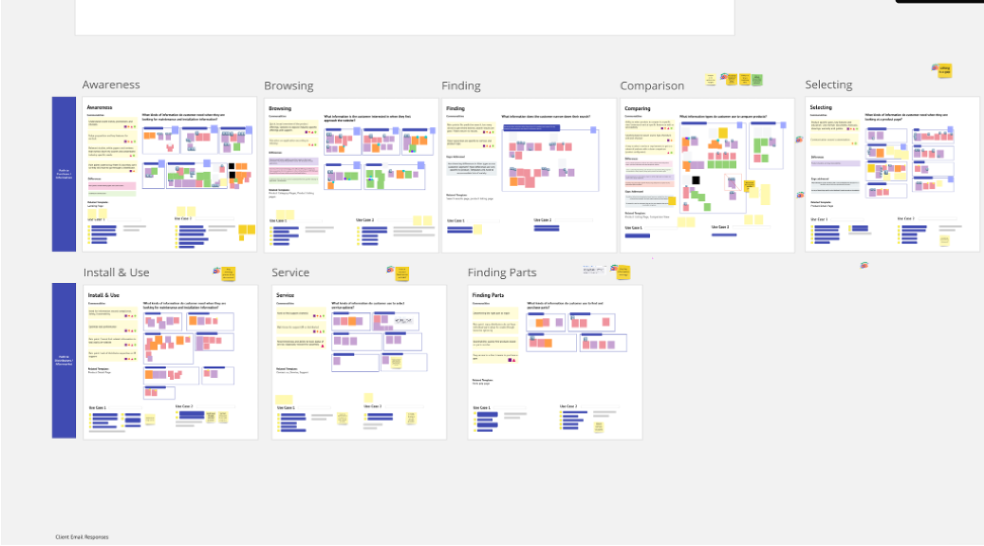
snapshot of workshopinformation architecture
Outlined current website hierarchy and information. Based on website recommendations and the technical audit, created a proposed restructuring of content and a simplified navigation
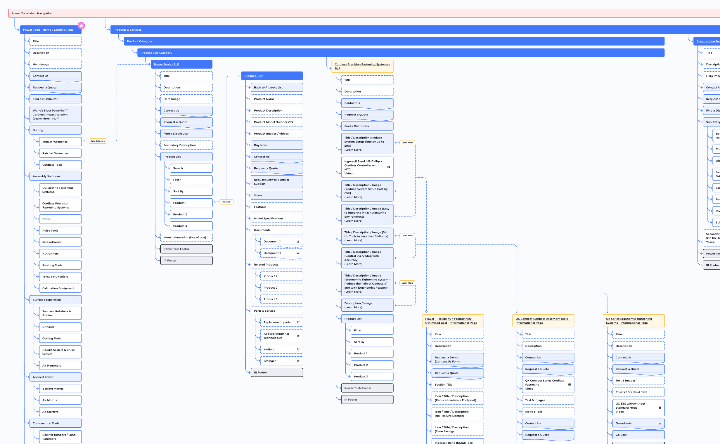
initial navigationBefore this project began, IR's internal team attempted to restructure their navigation. However, it still had a lot of nested content, creating user friction when searching for information. The proposed organization aimed to reduce the levels and simplify the overall content organization with a more generalized and consistent approach. The juxtaposition between the two helped to display the simplification for users - this was later tested with users.
We did run into a challenge since the IR departments were acting separately from one another and perceived their experience to be unique; therefore, they aimed to implement different domains which we advised against as it created issues for users when entering from the main IR site and are then unknowingly re-directed. We did propose a suggestion on how to communicate a re-direct to users if they chose to pursue separate domains.
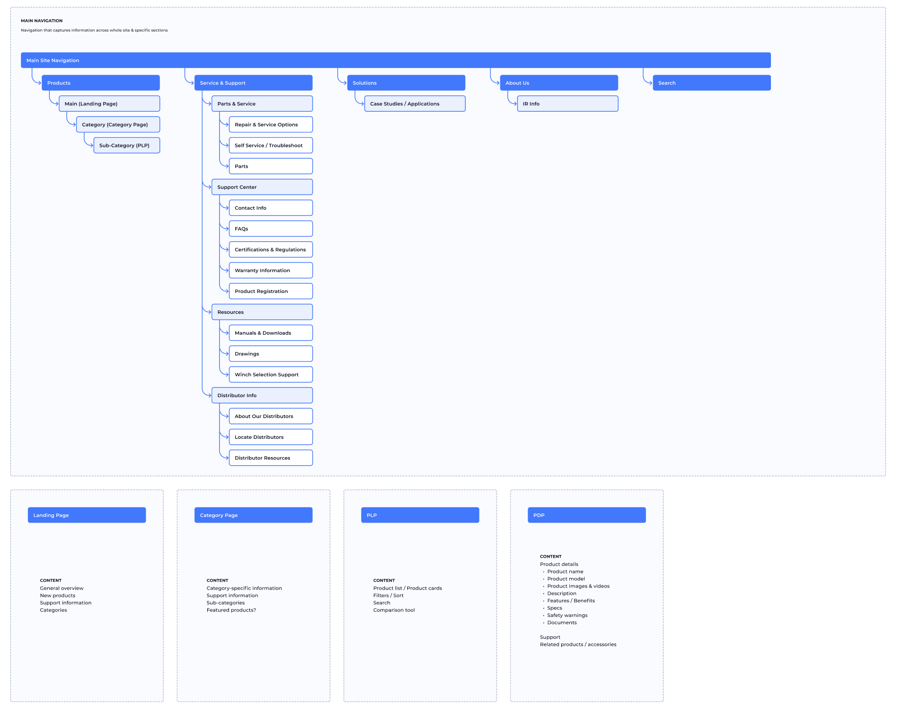
proposed navigation structurewireframes
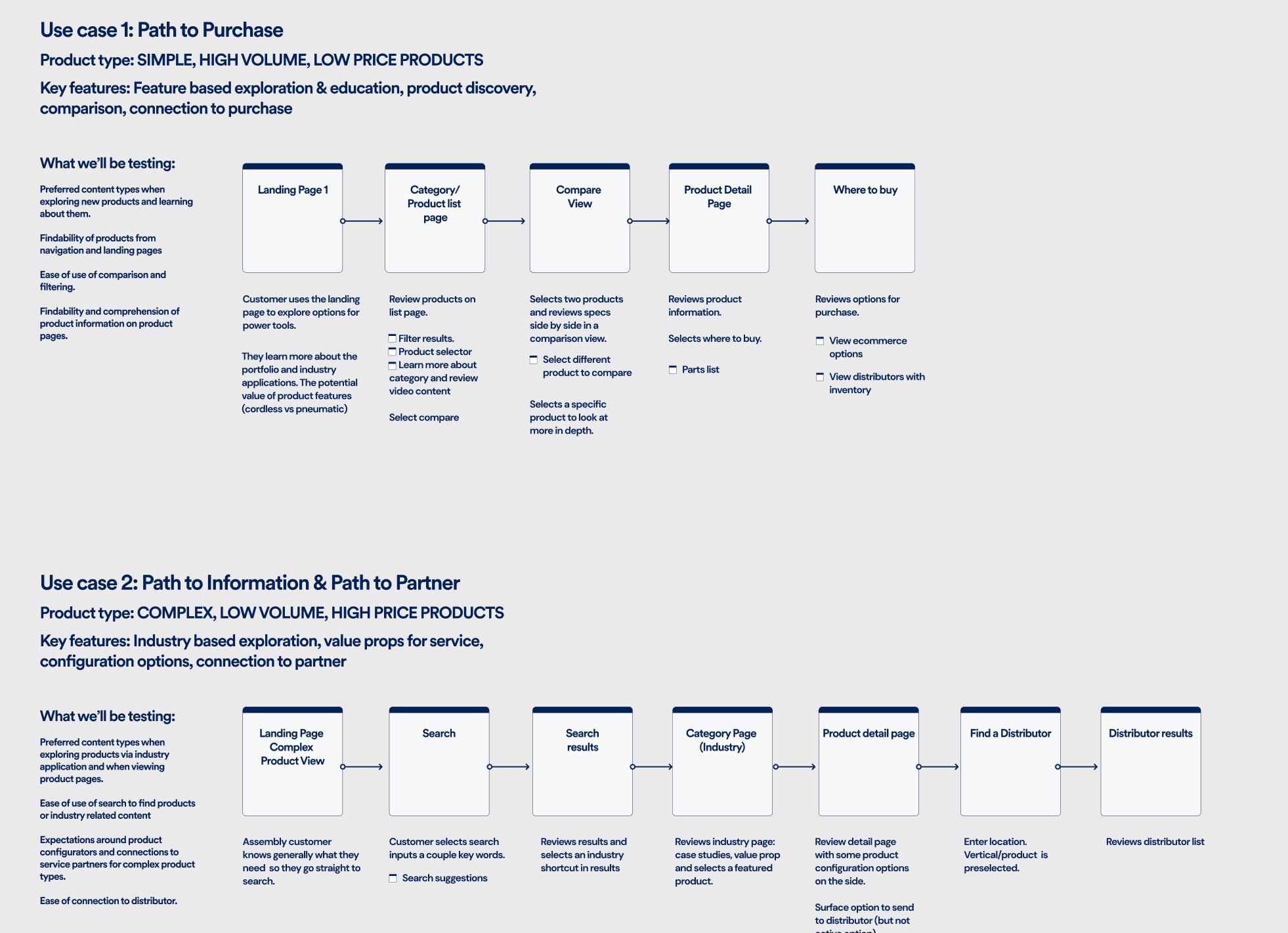
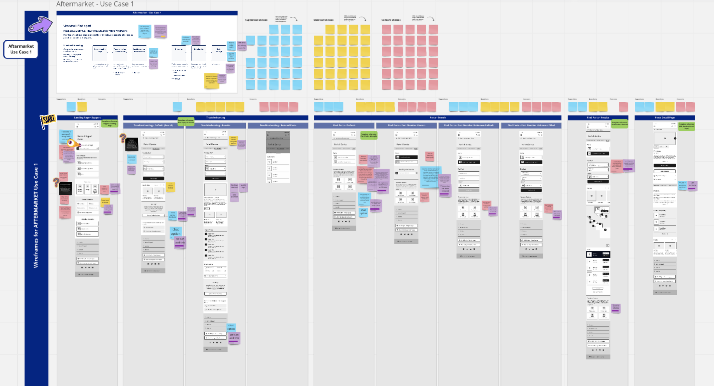
The wireframes mocked up two key flows based on use cases defined in the discovery phase.

We worked with the core team to align on content and content hierarchy by gathering async feedback and then converging.
user validation research
Conducted remote user interviews to validate the content strategy of the wireframes via prototype.

overview
The objectives were to validate the role of the website in the end customer’s purchasing process (nationally and internationally) and the content types and functionality of the core landing pages and product detail pages. Findings were captured in a research readout and recommendations were applied in the high fidelity design iterations
industries tested:Industrial Automation
Shipbuilding
Automotive
Chemicals
Oil & Energy
roles:Validation Engineer
Engineering Designer
Automotive Technician
Process Engineer
Field Service Engineer
Mechanic
8 particpants
visual design direction definition
Direction was developed using a review of mood boards and high level visual design concepts.

After studying the competition, learning from successful methods, and gathering user feedback, we created 6 versions (featuring the home page and PDP) before aligning on a final visual direction
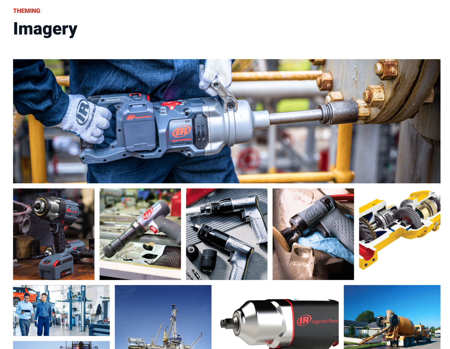
We were given the freedom to explore fonts and image treatments outside of IR’s current brand and the incorporation of a new accent colors.

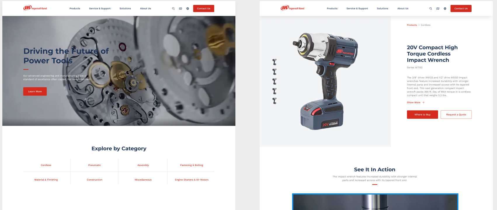
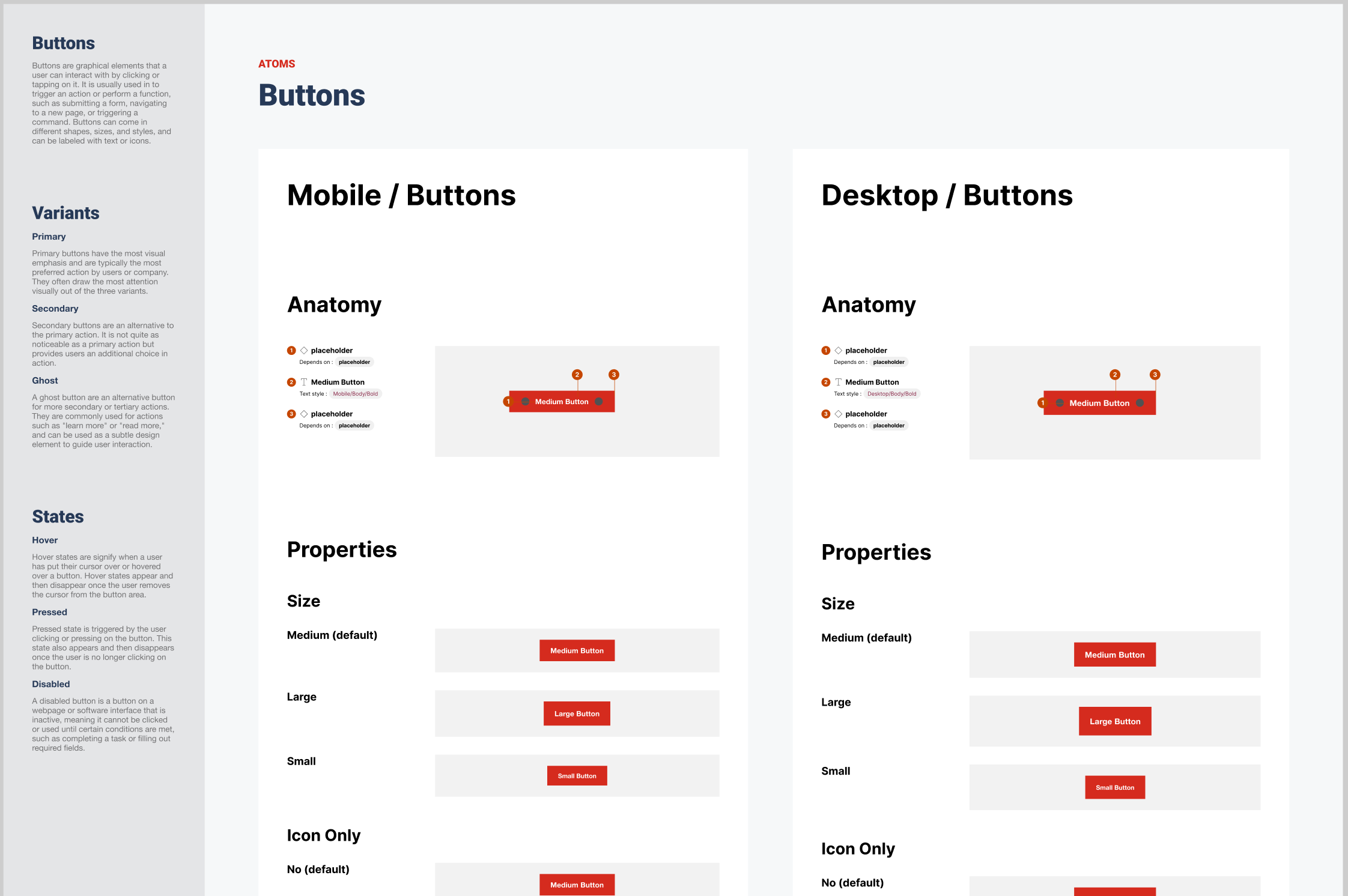
template designs
Created polished design mockups of the home page and product detail designs that showcased all the finalized design elements from the library and style guide.
All templates were stress tested using German, as IR had informed us that it was the “worst case scenario” as far as character count. The designs and components were created to be flexible and supportive of multiple languages across mobile and desktop. They were designed using a standard grid system for responsive views.

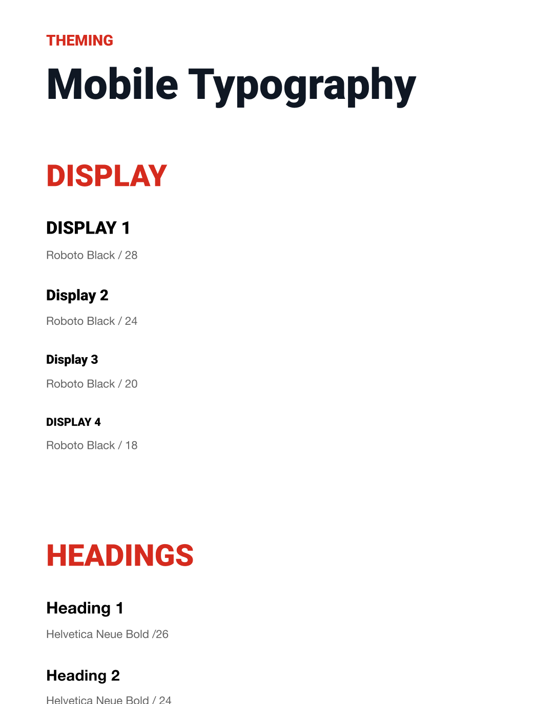
digital style guide
Provided a detailed guide for IR to use moving forward outlining the overall component anatomy, layout and spacing, properties, states and interactions.
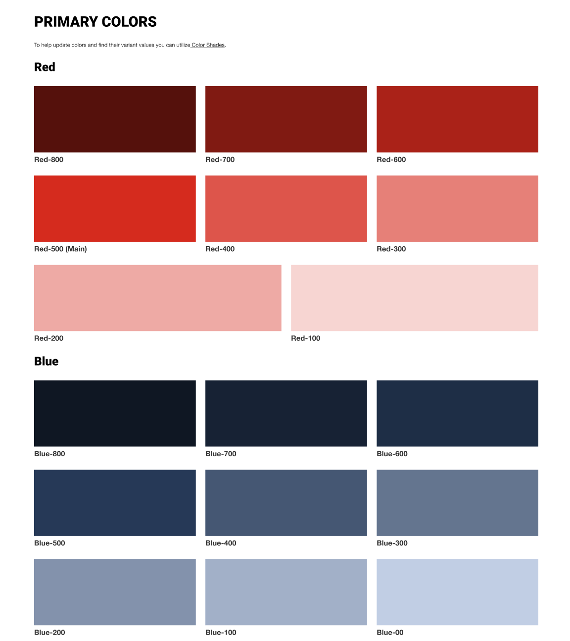
New colors, fonts and image treatments were created so we provided detailed guidelines, accessibility practices and specs for easy adoption.

component library
Used Figma to create a set of standardized, flexible, reusable components for visual consistency that followed atomic methodology - in total, over 100 components were created.
Flexibility was extremely important to IR - from color options to image displays. The components are to be used as building blocks for future pages and templates.
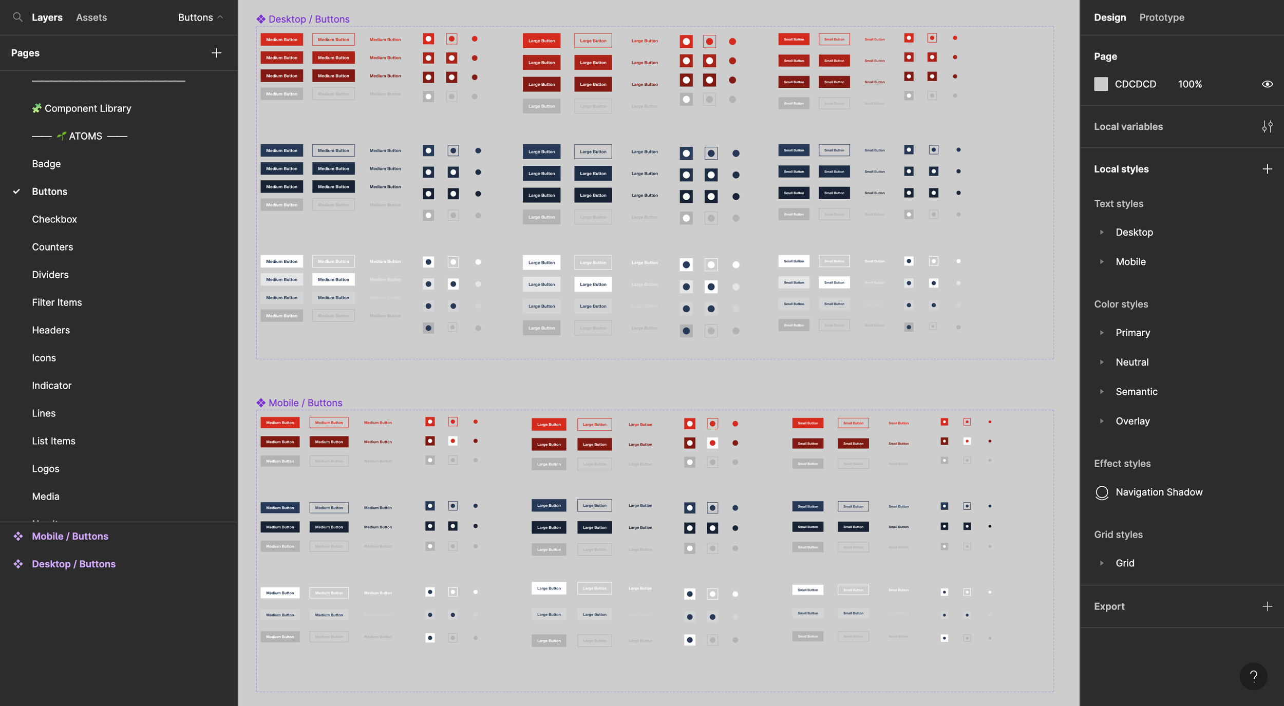
Components were defined for both mobile & desktop

interactive prototype
Created interactive prototypes featuring the designed templates for both desktop and mobile devices

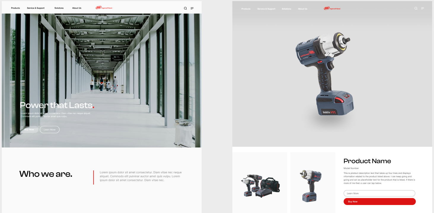
previous vs. proposedpost-mortem
This was an extremely challenging project. The initial scope and outlined timeframe was very aggressive and we ended up having to add 3 weeks to the project and 4 additional resources to help manage the overall workload.
We had limited access to prior work that was done by other agencies so we were unsure if we would replicate something - this was an issue when creating design iterations, in which one iteration the client felt like it was similar to a previous option. The stakeholders provided little guidance at times such as repeatedly asking for a “wow factor” but unable to provide examples or explain what “wow” meant to them other than, “we’ll know it when we see it.”
IR stakeholders were unfamiliar with product design and processes so there was a lot of education needed - this resulted in having to give full detailed weekly presentations. The weekly presentations cut into the time spent on deliverables.
There were many stakeholders with varying opinions which made decision-making difficult - we would get mixed feedback or feedback would rapidly change. When iterating on the visual design, there were multiple times where the team would love a design option and within 24 hours retract their sentiments. They also wanted us to break away from their current brand and implement new accent colors and fonts and alter the feel of their imagery. We had limited content to work with as their marketing teams were producing new photography and trying to create more robust content for all of their products.
Also, there were technical, system and platform constraints which we had to take into account. We attempted to sway them away from some practices such as implementing different domains across their various product types as it made it difficult for users to navigate to IR’s full product suite and impacted analytics.
I really enjoyed creating the different interaction patterns, micro-animations and the interactive prototypes. Ultimately, we delivered and executed a really well documented and detailed set of assets for the client to move forward with and we were able to make a hard-to-please client extremely happy with the direction and deliverables in spite of poor past experiences.
Experience & Content Audit, Website & Navigation Recommendations, Information Architecture, Wireframes, Interactive Prototype: Corinne Miller | Technical Audit: Josh Miller | User Journeys, Vision Alignment Session, User Validation, Stakeholder Interviews: Corinne Miller, Priyanka Gaitonde, AnnaRose Girvin | Content Strategy: Priyanka Gaitonde, AnnaRose Girvin | Digital Design Exploration Interaction Patterns, Template Designs, Digital Style Guide, Design System/Library: Corinne Miller, Lindsay Cutsler, Kayla Winbush | Delivery Manager: Dana Fox