

- a design resource -
Flowy

Creating a community design resource for users to quickly produce uniform IA, user flows and process maps.
Available on Figma Community!

why flowy was created
I love organization and structure and had struggled to find a file that contained all that I needed while trying to organize information and data so I made Flowy.
IA is a fundamental element in creating a great user experience and is often underrated.
Flowy was created with the strong belief that, "You can't really know where you're going until you know where you have been" - Maya Angelou.
overview
goals
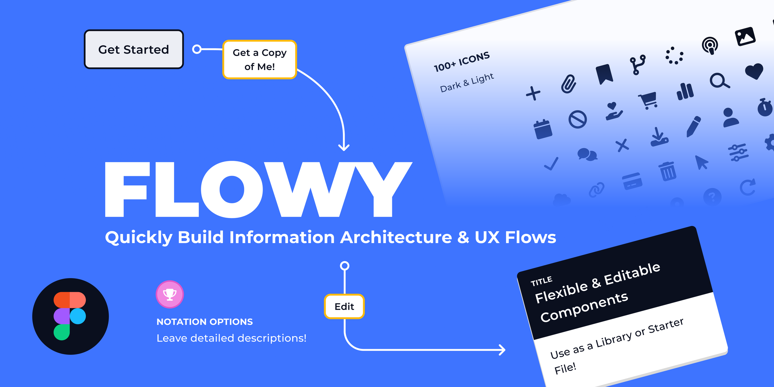
Create a design resource that can be used to quickly produce uniform IA, user flows and process maps and can be used as a library or starter file with a range of features and flexible and editable components.
Easy to use for designers and non-designers
Flexibility and customization across components and elements
Ensure all standard/basic components are included
Can be applied and used in client projects
the process
Research
Style library
Components
Tested on real projects
Beta tested with select group of users
Refined designs & included use examples
Added guidelines & component descriptions
Informational presentation on IA and Flowy as a tool for internal design team (Method) for early adoption
Release on Figma Community
the power of ia
Information Architecture plays a pivotal role in the build and design of a product. It is important to organize, structure and label content in an effective and sustainable way.
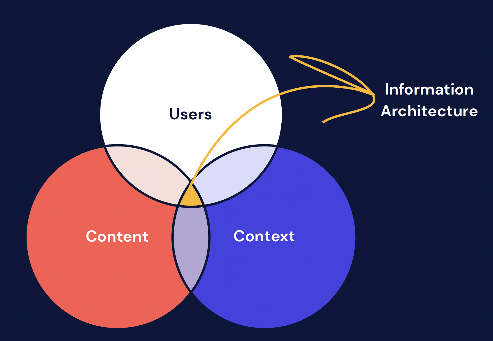
Defining ia
Information architecture is the cross section of users, content and context
Content should be organized in a way that it provides context to a user and so a user can navigate through content in a contextual way
“Good design, when it’s done well, becomes invisible. It’s only when it’s done poorly that we notice it.”
— jared spool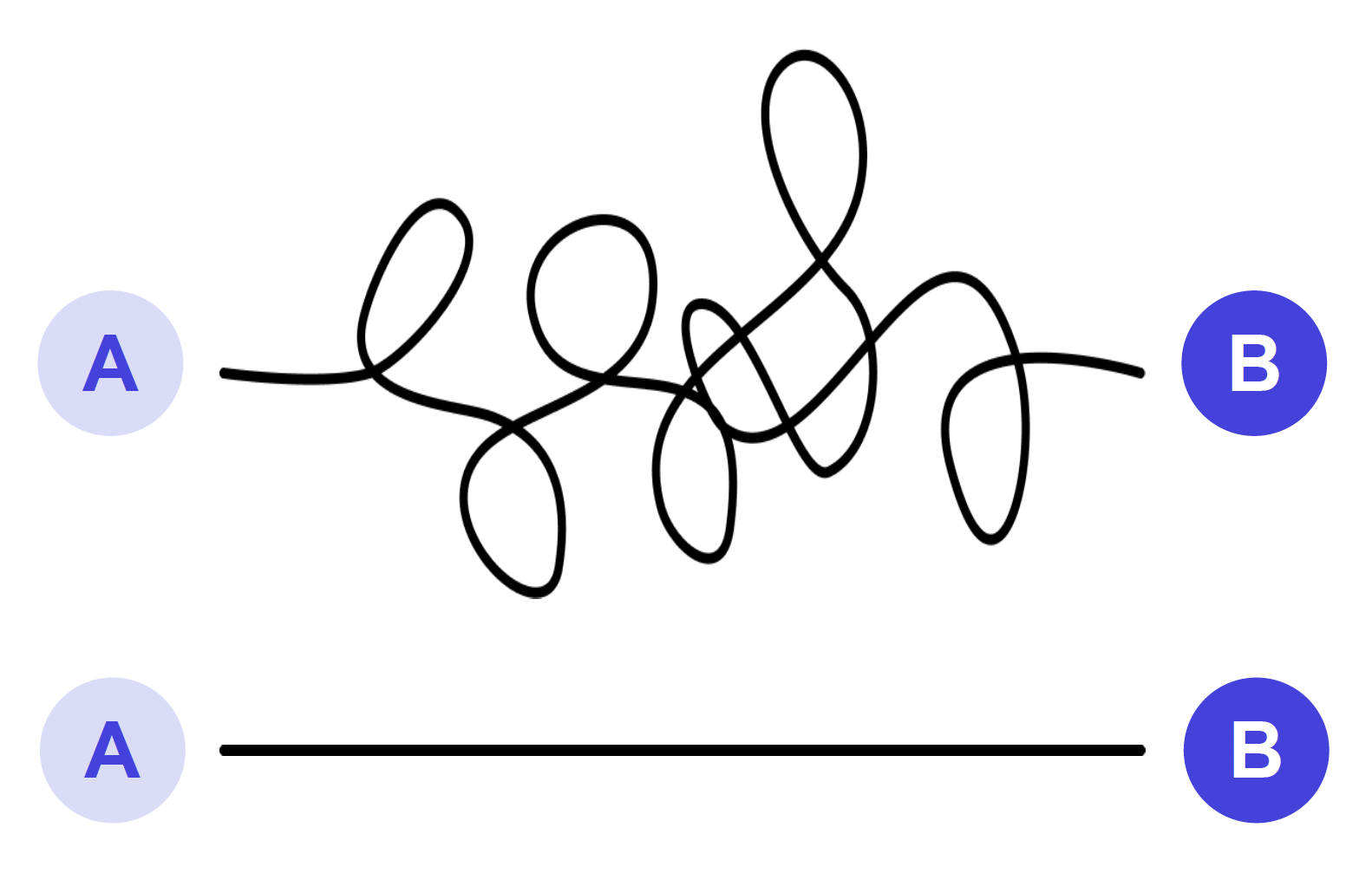
time is valuable
Users are impatient when it comes to poor user experiences.
IA is used to create a direct path to information based on user behavior.
The Benefits
Simplification of complex information
Helps to outline build plan for engineers
Compare live state with futures state
Better onboarding of internal & external teams
Set client expectations & confirm project scope
Reduce marketing costs
Reputation & SEO ranking
Reduce cost of live help support & documentation
Increase sales & customer loyalty
Acquire new users
Designer & team
client & user
the finer things
It’s all in the details…
A section called Pro Tips was included as a way to allow designers and non-designers with varying degrees of Figma expertise the ability to gain confidence with using the different components and building standard IA structures
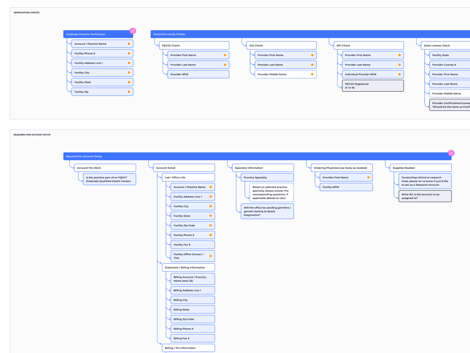
Examples of IA structures, user flows and process maps were included for users to use as a starting point or reference and to showcase all the different components across different applications
Included informational tool tips on all components to accommodate users with varying levels of subject matter knowledge
Utilized Figma’s component properties and used them across all components along with setting preferred options for quick selection
All text and color styles are fully editable and will update across the entire file if changed, making it easy for users to create branded IA and user flows and to use Flowy as a library
All connectors are fully flexible and editable - the connectors can be stretched in any direction and the label will remain fixed at the starting point. A user can edit the color, style, label and start and end caps to each connector from the properties panel.
Tried & tested
Flowy isn't just for looks - It has been tested and used across various projects to ensure it will meet your needs when creating IA and flows. Flowy has been used on projects containing simple and complex IA structures and UX flows.

what’s included
All the good stuff
fully customizable & flexible
Use as a library or starter file
Change text styles or colors to match your brand
Pro Tips section to help you get comfortable using components and creating IA structures
Helpful informational tool tips across all components
Examples to get you started
easily make style changes
All components utilize component properties
Select from different styles and colors
Easily switch out text
Turn on and off different features such as leading and trailing icons
Preferred values for easy-select options
included components
12 different block styles
10 Badge colors with the option to change between icons or text
5 Label options
32 Connectors, all flexible with different styling options
100+ svg icons from Fontawesome's free icon library with the ability to switch between light and dark
Notation options including editable groupings, info cards, general notes, header and a legend
Available on figma community
Increase your IA game and share with friends!